HISTORISCAN
Dive into the past with a single click.
Ready to journey through history?


INTRODUCTION

Every city corner holds a story, a fragment of history that, when pieced together, forms the tapestry of its heritage. Traditionally, human guides have been our primary access point to these stories. However, in today's fast-paced, digital-first world, there's a clear need for a more flexible and personalized way to engage with urban history. Relying on human guides can sometimes be limiting due to schedules, varying expertise, or tailored interests.


THE CHALLENGE

Design a way for learning a city's history that doesn't require human guides.

Details

HOW LONG DID IT TAKE?

Designing: 3 weeks
Developing: In progress

WHAT WAS MY ROLE?

Sole UX Designer
Research, Wireframing, Prototyping, Visual Design, FE Developer

WHAT SOFTWARE DID I USE?

Figma
Adobe CS (Photoshop, Illustrator)
Visual Studio Code

To create a solution that truly resonates with its users, I first needed to understand who the users are and what they desire from such a product.

Because this challenge could relate to a wide audience, I researched three personas that represented the target users. Understanding some of their pain points, would give me some insight into their needs and expectations for this product.

MEET
ANTONIO, DONNA, & LUCY
profile shot of young man goatee and earrings

Adventurous Antonio

"I want to bring my followers on a journey through time and history with my posts!"

profile shot of a woman with curly hair

Dedicated Donna

"I want to bring history to life for my students. The more interactive, the better!"

profile shot of a young woman with glasses

Local Lucy

"Disability should not be a barrier to learning. With the right tools, we can explore the world in our own ways."

Antonio Lopez

profile shot of young man goatee and earrings

AGE

JOB TITLE

LOCATION

LANGUAGE

35

Travel Blogger

Madrid, SP

Spanish

About Antonio

Antonio loves travelling and exploring new cities, particularly their historical landmarks. He is an avid user of technology and relies on various travel and navigation apps during his journeys. Antonio enjoys sharing his travel experiences with his followers, often focusing on the history and cultural significance of the places he visits.

Pain Points

  • Language can be a barrier in non-Spanish speaking countries.
  • Standing out from other travel bloggers and finding exclusive information can be difficult.

Donna Jones

profile shot of a woman with curly hair

AGE

JOB TITLE

LOCATION

LANGUAGE

28

Teacher

Toronto, ON

English

About Donna

Donna is a history enthusiast who enjoys exploring historical buildings and monuments during her free time. She is tech-savvy and often uses her smartphone to look up facts and information. Donna believes in interactive learning and often organizes field trips for her students to learn about local history.

Pain Points

  • Online resources often provide conflicting information, and guidebooks are bulky to carry around.
  • Many educational resources are text-heavy and don't engage her students effectively.

Lucy Schnieder

profile shot of a young woman with glasses

AGE

JOB TITLE

LOCATION

LANGUAGE

30

Developer

Berlin, GER

German

About Lucy

Lucy is a lover of history and culture and enjoys exploring her city's historical sites. Despite her visual impairment, she is tech-savvy and is familiar with assistive technologies. She believes in inclusivity and accessibility in all areas of life, including technology and learning.

Pain Points

  • Traditional resources like books or visual apps do not provide the accessibility she needs.
  • Finding resources that are both fully accessible and provide a comprehensive learning experience can be difficult.

UNDERSTANDING THE USER'S GOALS

After empathizing with some of the users' challenges, I summarized some of the key goals:

  1. Access the information in a visual interface that can provide real-time information.
  2. Discover new places and learn historical facts at their own pace.
  3. Have a reliable tool with accessibility features to learn about historical buildings and monuments.

THE PROBLEM

How can I provide history enthusiasts with an intuitive, engaging, and informative solution that allows them to independently discover and learn about historical sites and monuments in real-time?

BRAINSTORMING

So I brainstormed some possible ideas.

Self-guided tours using AR or VR glasses

Install interactive kiosks at major tourist sites

App wil built-in voice-over information for people who are visually impaired

Create a gamification app that incentivise users to go to different places for points and rewards


AR overlay that scans a building or site with smartphone and gives tourist info in real-time

Self-driving trams or buses that stop at major tourist sites

Drones that can offer birds-eye view of the city landmarks

Have variety of tours like food, shopping, arts, entertainment

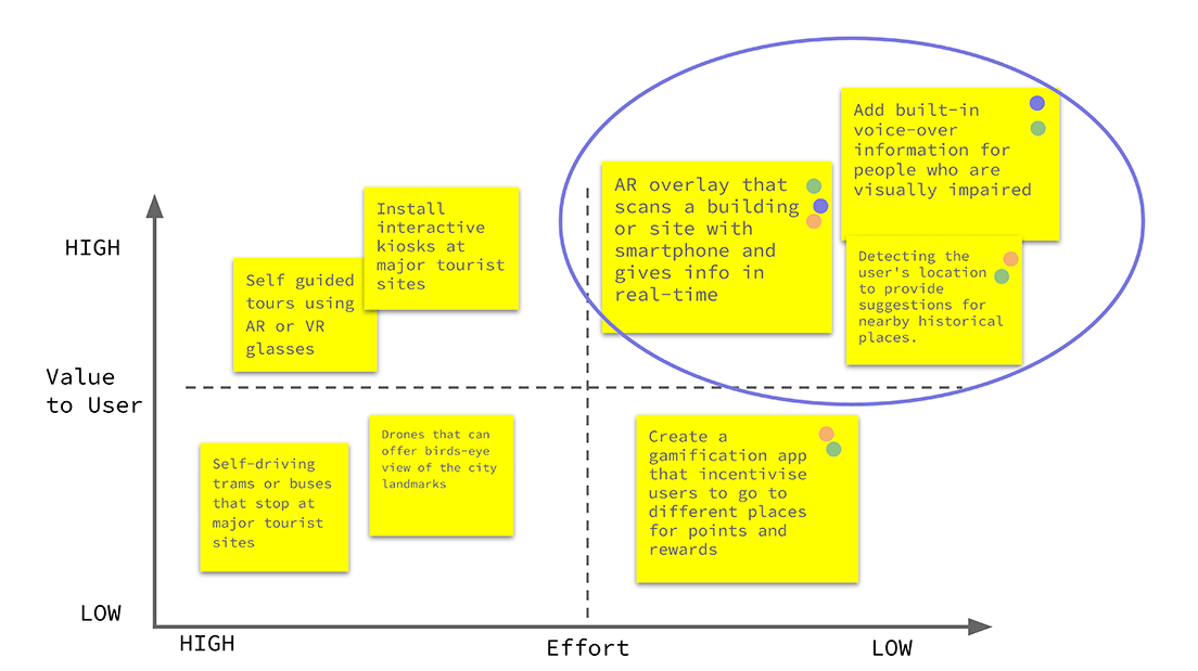
PRIORITIZATION MATRIX

Using an IMPACT versus EFFORT matrix, I was able to prioritize the ideas and visually see what would be the best solution given this criteria.

It resulted that designing an AR overlay that scans buildings with a smartphone would be the likeliest MVP for this project.

ASSUMPTIONS

Based on the the user's goals, I made a few assumptions that would help me with the design of this product.

1.

Users have smartphones compatible with AR technology.

2.

There's a demand for self-guided exploration.

3.

Users have reliable internet connectivity.

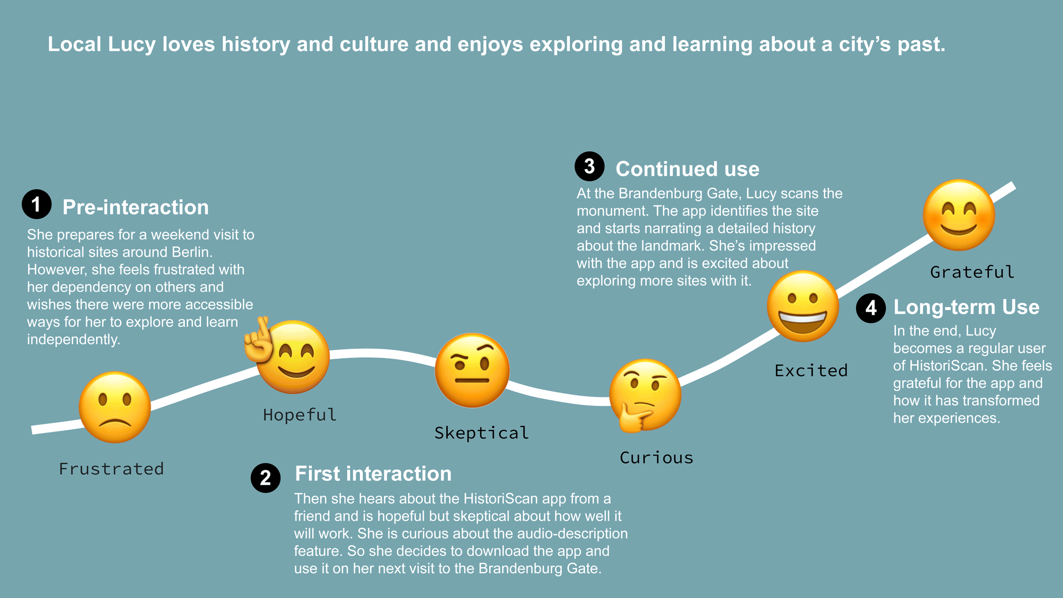
LUCY'S JOURNEY

I set out to create a journey map of steps a user would take while using this app - before, during, and after.

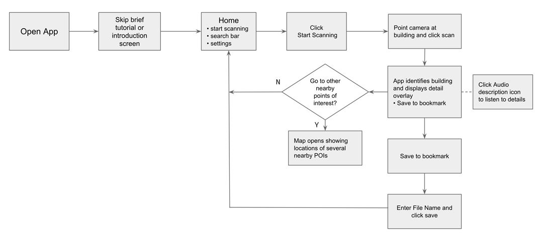
APP USER FLOW

I sketched the linear task for the Bookmarking information flow of this app. I realized that there were a couple of actions that could be eliminated to lighten the flow.

Assuming that the user will have opt-in for camera access and set up their language preference during onboarding and initial set up, I reiterated my original flow and simplified it to make the path flow a little cleaner.

WIREFRAMING

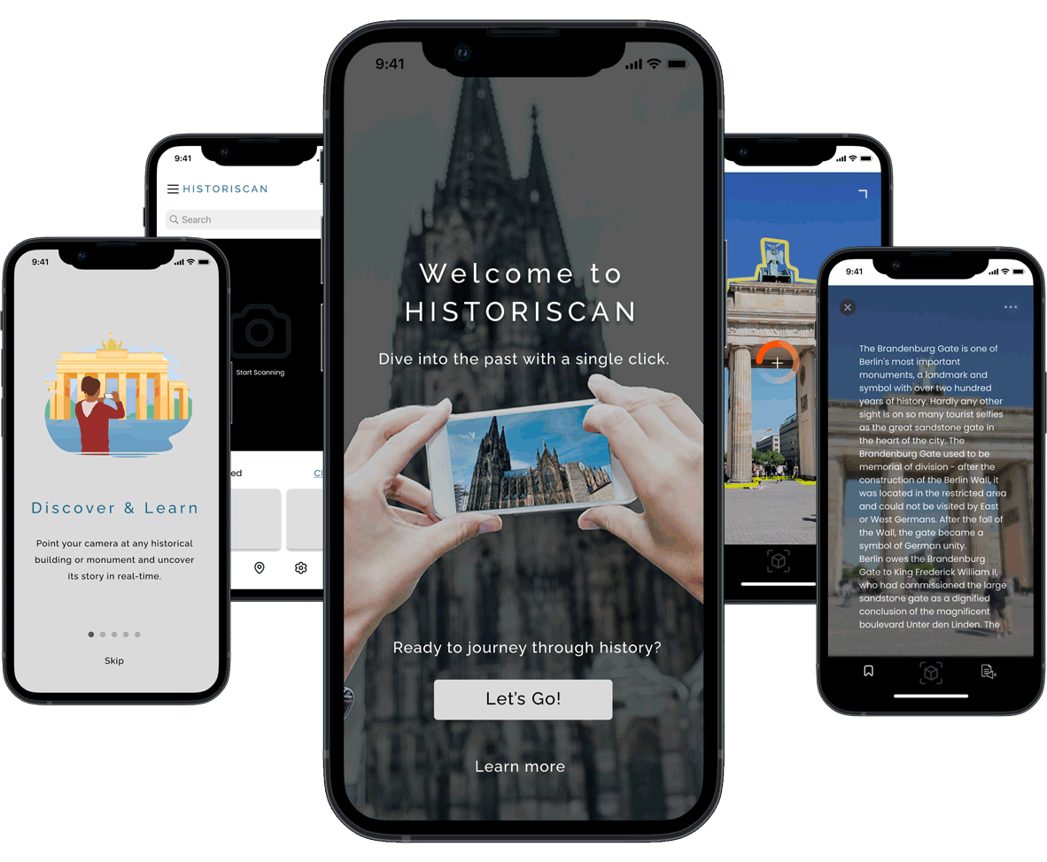
Next, I began wireframing key user journey touchpoints. Starting from onboarding which gave some introduction of what to expect from this app.

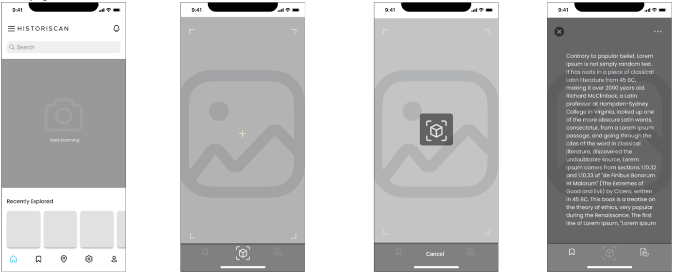
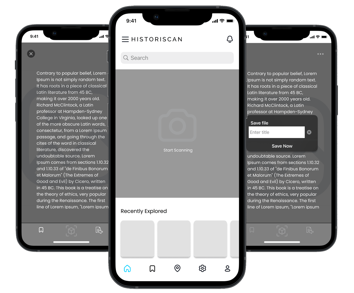
Then I wireframed the user flow from the homepage starting from pointing the camera towards a monument, receiving data, and saving favorites.

I made sure that the UI is simple and intuitive, reducing the cognitive load for the user. I carefully designed every frame to provide the user with the information they need in the least amount of steps possible.

→ Lo Fidelity Prototype

USER TESTING

With my wireframes ready, I developed an interactive prototype. I tested this with four users, observing their interactions, understanding their pain points, and gathering feedback.

Objective:
Their task was to scan a monument of interest and save it to their bookmark. I encouraged them to click around to familiarize themselves with the app.

Participants: We conducted tests on 4 participants ranging from ages 17 - 57, from differing professional backgrounds.

ITERATIONS AND HI-FI PROTOTYPE

Post-testing, I refined my design based on the feedback gathered.

Some of the following iterations to the app were improved:

→ High Fidelity Prototype

KEY LEARNINGS

  1. Users appreciated a brief tutorial or introduction when they first opened the app. This emphasizes the importance of effectively onboarding users to ensure they understand how to use the app and its features.
  2. Users were impressed with the real-time feature and its accuracy, indicating that this is one of the app's key strengths. However, some users suggested improving the scanning speed, indicating room for performance enhancements.
  3. The audio-description feature and multilingual support were particularly valued by visually impaired and non-native English speaking users respectively. This highlights the importance of inclusive design and accessibility in enhancing user experience.
  4. Feedback from users indicated potential areas for feature expansion, such as an offline mode and a gamification feature.

RESPONSIVE WEBSITE DESIGN (RWD)

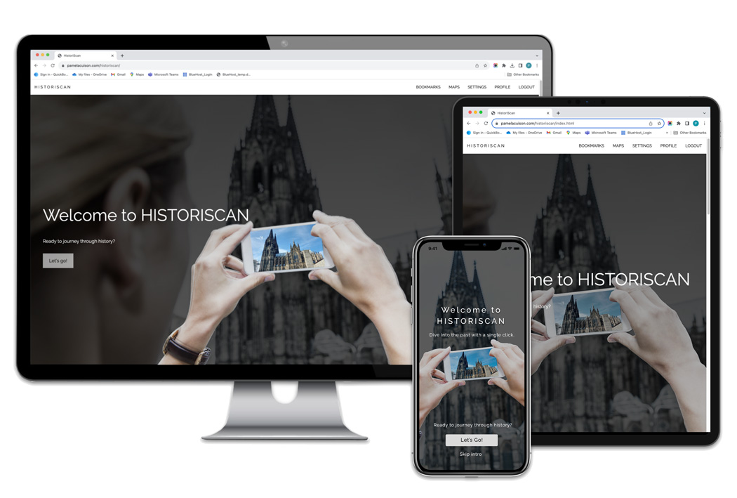
As part of this project requirement, I developed a fully responsive website. The purpose of this site is a way for users to access the information they saved from the app on other devices including desktop, laptop or tablet at any time.

With the help of w3.css, I created the onboarding introduction flow as a zigzag river layout and the "My Bookmarks" page as cards with expanding and collapsing text.

Here's a sample of the live page...

→ HistoriScan Website

FINAL THOUGHTS

In conclusion, HistoriScan achieved my initial objective of creating an accessible, informative, and user-friendly application that enhances the experience of exploring buildings and monuments.

From identifying the problem, understanding the user needs, creating user personas and journey maps, to ideating solutions and conducting user testing, I was able to appreciate how each step of the process contributed valuable input to the design and development of the app.

HistoriScan has the potential to redefine how we learn about history and architecture, making every journey a unique educational experience. I believe it is well-positioned to become a valuable tool for students, educators, tourists and anyone interested in exploring and learning about historical sites independently and interactively. The user feedback highlighted areas of improvement and potential new features which have presented opportunities to further evolve the app.

NEXT STEPS

My next step is to continue to improve and make updates based on user feedback. I would like to include enhancements to the onboarding experience, optimization to real-time features, introduce an offline mode, and even some gamification.